
Covering normally refers to songs being performed by other artists, but actual album covers attract their share of impersonators, too. The covered cover: Is it a witty reference, respectful homage or parody? Or is there a deeper meaning behind it? Up now: Queen versus The Verve.
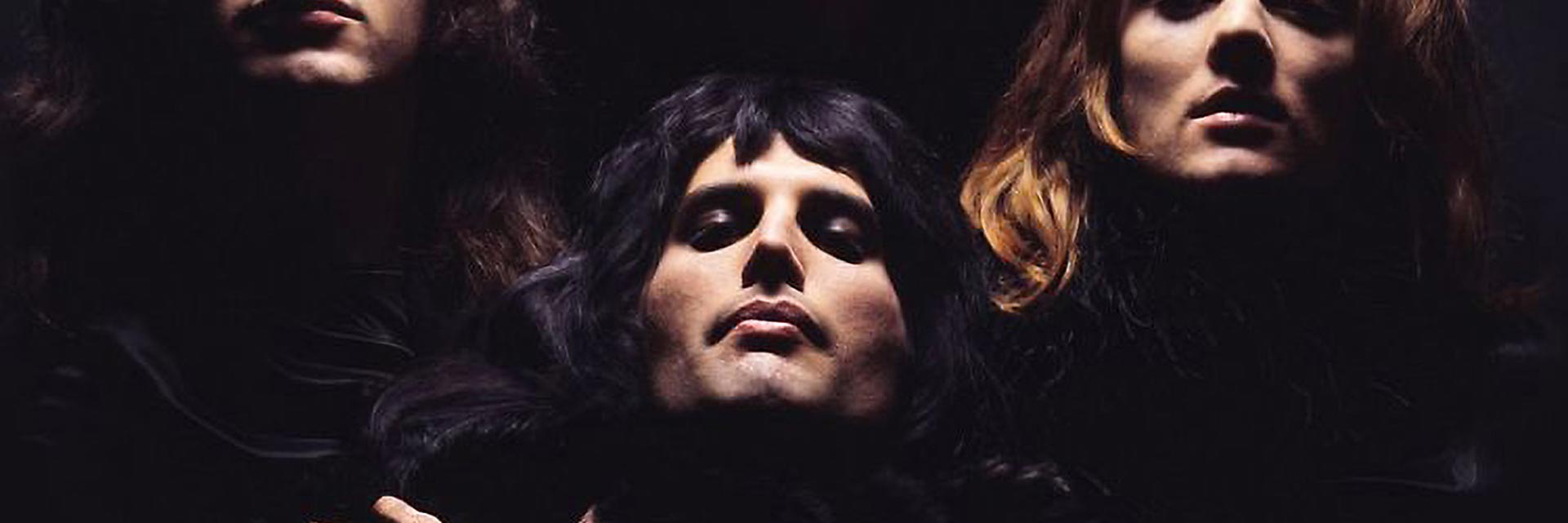
A touch of glamor was called for in 1974, so the members of the then still fledgling band Queen turned to photographer Mick Rock, who had made a name for himself with stylish photos of David Bowie and Iggy Pop. They wanted something eye-catching and exquisite for the cover of their second studio album, something that’d also reflect the content of the record. The A side, primarily the work of guitarist Brian May, was the “Side White”. The B side, which only featured compositions by Freddie Mercury, was the “Side Black”. The A side contained the track “White Queen”; the B side, “The March of the Black Queen”. Rock therefore shot the band in white and in black. The “white photo” found its way onto the inside of the flip cover and shows the four musicians all dressed in white in front of a white background. The “black photo” was used on the front. Only their four heads (and Freddy Mercury’s hands crossed over his chest) are visible in the black space.
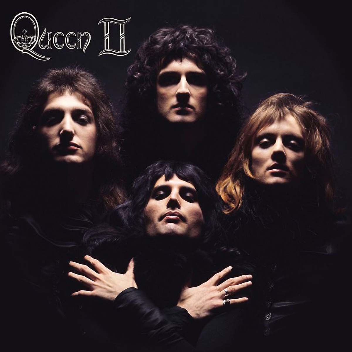
The photo became a classic: the light shining from above, the musicians’ eye sockets dark from the shadows cast, and their four heads arranged in a diamond formation — upright like “Easter Island statues,” according to one journalist. Rock had taken inspiration for this image from PR shots of Marlene Dietrich, legendary artistic photos shot in black and white. A portrait for the Sternberg film Shanghai Express had particularly caught his eye. In it, Dietrich is looking upward with her fingers on her lower jaw, holding a cigarette in her left hand, while everything around her is dark. Rock’s photo of the Queen band members became hugely famous when it served as the concept for the video of the smash hit “Bohemian Rhapsody” in 1975. Yet just one year earlier, the glamor effect of the record cover had been seen as rather overstated. Back in 1974 hardly anyone knew this band, let alone recognized their faces. Their first studio album hadn’t even made it into the charts in Germany. The musicians even raised concerns themselves that the photo could come across as too pretentious for a second album. “The image made them look like much more than they were back then,” Rock said. He was, however, able to allay their concerns.
The band made huge headway with Queen II, which reached No. 5 in the British album charts. The critics, however, remained skeptical. Melody Maker wrote: “It remains to be seen whether this band will manage to break through. If they do, I’ll eat my hat or something. Maybe they’re just too hungry for success. There’s no depth to the sound or feel.” However, the major breakthrough did come, at the latest with the fourth LP, the No. 1 album A Night At The Opera (in Germany No. 5 in the charts) and its No. 1 single , “Bohemian Rhapsody” (in Germany No. 7 in the charts). You can actually find the ingredients for their recipe for success in Queen II. “The March of the Black Queen” is a kind of practice run for “Bohemian Rhapsody”. “The Fairy Feller’s Master-Stroke” is like a prequel to “Seaside Rendezvous”. “Procession” is the prototype for “God Save The Queen”, and “Nevermore” a lead-up to “Love Of My Life”. In 1974, all that was missing was simply the clarity, the emotiveness, and the courage to display unbridled pretentious swank. The album cover, however, was a good start.
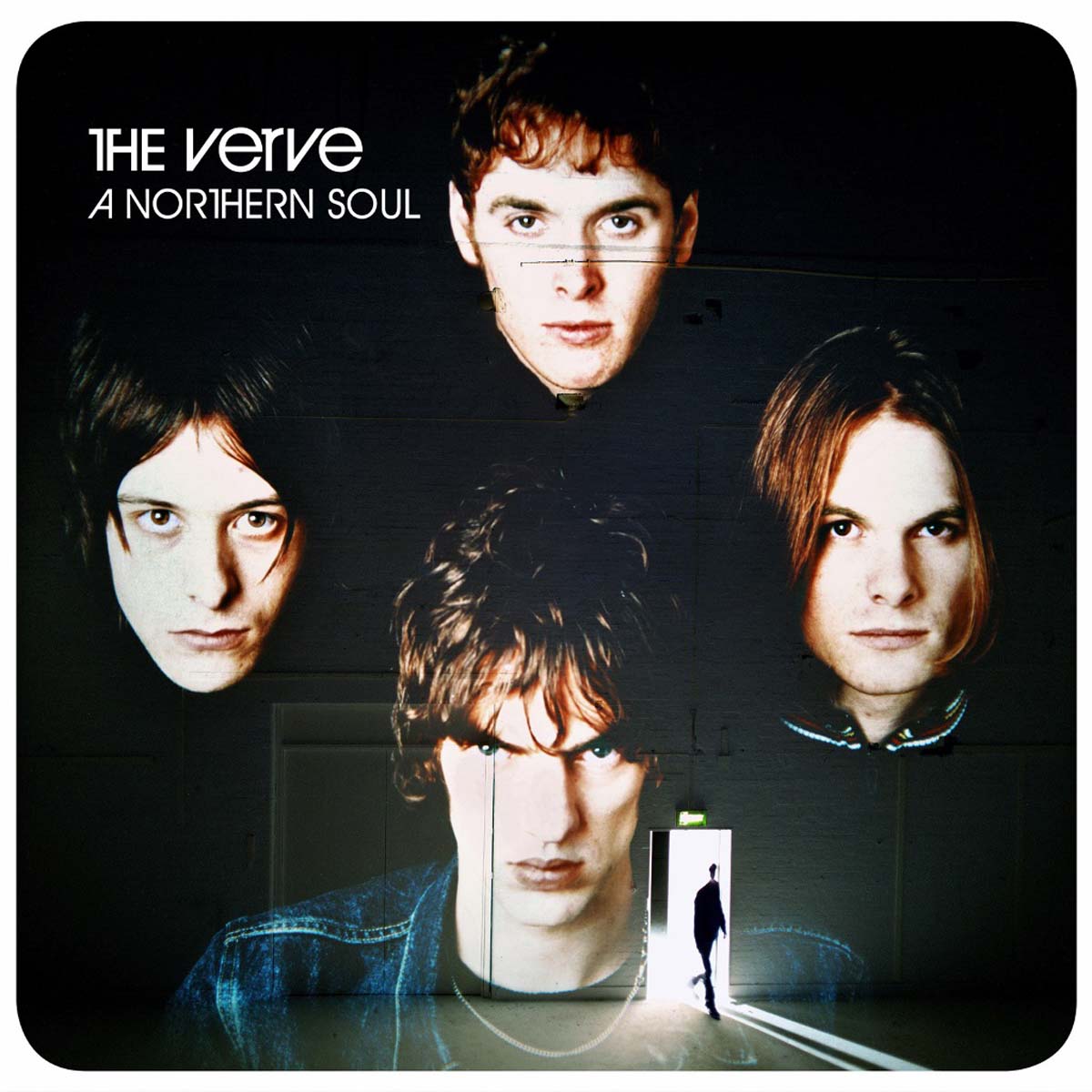
Around 20 years later, The Verve were also about to record their second studio album. The band’s Freddie Mercury was Richard Ashcroft, and their Brian May was Nick McCabe. As was the case with Queen, The Verve needed to somewhat reset the musical direction their debut album had taken. Even the band’s name, which originally had no article, had to be slightly changed as the label Verve had threatened a lawsuit. And, as with Queen, the band’s real breakthrough came some time later. The album cover was produced in several stages. First, the band members were photographed in black and white, then color was later added to the photos. The portraits were then projected, in the well-established diamond formation, on wall inside a London warehouse — hence the lines on the musicians’ faces, which are the result of the wall structure. At the bottom you can see the open door to the warehouse with the silhouette of drummer Pete Salisbury.
The studio recordings for A Northern Soul were also laborious as a lot of time, drugs, and emotions were involved. The ecstasy party to open the sessions alone lasted two weeks. Ashcroft’s little detour to London for “affairs of the heart” resulted in a three-month absence. Experienced producer Owen Morris said afterward: “It’s not a process that I’d ever want to go through again”. The super-talented guitarist McCabe called it “a complete and utter nightmare”. In 1995, bands such as Oasis, Blur, and Pulp were the new kids in town. Alternative rock in Britain had a new name: “Britpop”. The Verve brought a psychedelic and soulful undertone to this scene — a hypnotic pull with billowing guitar riffs and vocals that were sometimes reminiscent of Jim Morrison and Mick Jagger. This album gets better and better each time you listen to it. However, it doesn’t offer much in the way of variety as the William Blake-induced sentiment runs through all 12 tracks. These are “songs in the key of pain”, as critic Nick Southall once wrote. The band broke up for awhile after this experience in the studio. They must have all been pretty exhausted.
Queen: II (EMI 1575531)
The Verve: A Northern Soul (Hut CDHUT 27)